引子
在学术论文中,很多数据的展示需要依靠Python的Matplotlib库来展示,本次通过绘制几种图像,大概说明一下应用Matplotlib库进行学术论文图像绘制的基本流程。
柱状图的绘制
数据准备
我们实例的数据部分代码块为:
if __name__ == "__main__":
    # Get data
    test_data_dict_odd = {
        "test_bar_a": 1,
        "test_bar_b": 3,
        "test_bar_c": 5,
        "test_bar_d": 7,
    }
    test_data_dict_even = {
        "test_bar_a": 2,
        "test_bar_b": 4,
        "test_bar_c": 6,
        "test_bar_d": 8,
    }
我们要在同一张图中,展示两组数据。
Demo图的绘制
首先,展示一下test_data_dict_odd的柱状图版本:
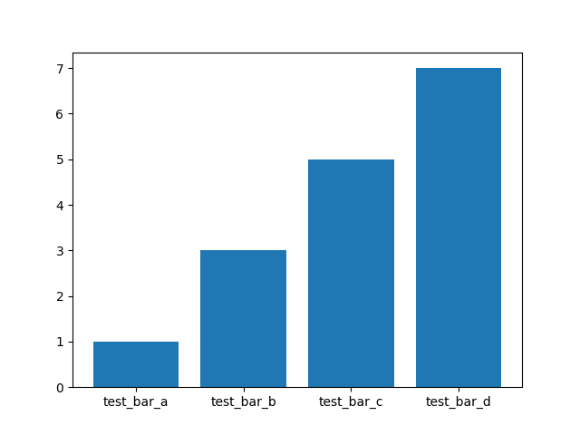
其代码为:
    # Set the figure
    fig, ax = plt.subplots()
    plt.bar(
        test_data_dict_odd.keys(),
        test_data_dict_odd.values(),
    )

    # Show the image
plt.show()然后,展示test_data_dict_even的柱状图版本,其代码为:
    # Set the figure
    fig, ax = plt.subplots()
    plt.bar(
        test_data_dict_odd.keys(),
        test_data_dict_odd.values(),
    )
    plt.bar(
        test_data_dict_even.keys(),
        test_data_dict_even.values(),
    )

    # Show the image
    plt.show()
图片为:
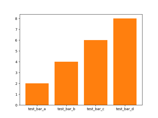
我们发现,来自第二个数据块的信息盖住了第一个数据块,为了让两个柱都显示出来,我们需要做一些调节。
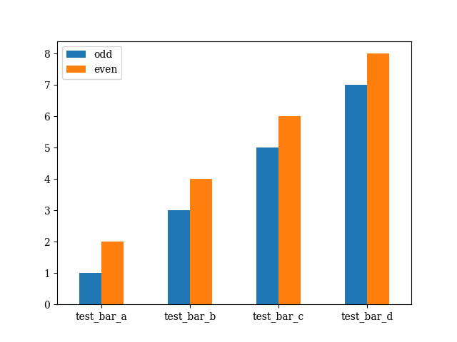
多柱图的绘制
这里,我们可以将这两组数据塞进一个DataFrame中,这是pandas库的一个数据结构:
    df = pd.DataFrame({
        "odd": test_data_dict_odd.values(),
        "even": test_data_dict_even.values(),
}, index=test_data_dict_odd.keys())然后,应用DataFrame自带的plot()方法进行绘制:
df.plot(kind="bar", rot=0, width=0.5)结果如下:

这时,我们已经完成了初步的绘制工作了。
代码中,rot代表label的旋转度数,如果设为默认,label会默认逆时针旋转90°。
字体的调节
学术论文的编写通常需要使用LaTeX,LaTeX通常使用的是衬线字体——Computer Modern。那么,我们的图像最好也使用衬线字体进行绘制。在文件的头部,加入:
import matplotlib
matplotlib.rcParams.update({'font.size': 20, 'font.family': 'serif'})
结果为:
图名、轴名的绘制
这样还不够,我们需要声明这个图是干什么用的,轴的意义是什么:
    # Set the name of figure
    plt.title("Test Bar Chart")

    # Set the name of x-axis
    plt.xlabel("Test Bar")

    # Set the name of y-axis
    plt.ylabel("Value")
结果为:

颜色的调节
这样的图还是有一些丑,可以通过如下的代码调节:
df.plot(kind="bar", color=["#66ccff", "#ff6666"], width=0.5, rot=0)结果为:
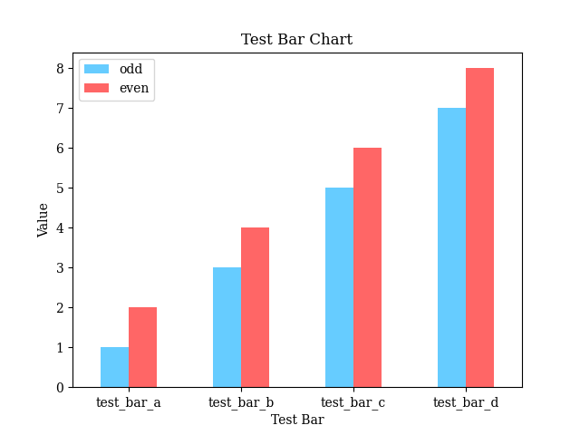
我个人比较常用的颜色网站是:NIPPON COLORS - 日本の伝統色。
代码
import matplotlib.pyplot as plt
import pandas as pd

import matplotlib
matplotlib.rcParams.update({'font.family': 'serif'})


if __name__ == "__main__":
    # Get data
    test_data_dict_odd = {
        "test_bar_a": 1,
        "test_bar_b": 3,
        "test_bar_c": 5,
        "test_bar_d": 7,
    }
    test_data_dict_even = {
        "test_bar_a": 2,
        "test_bar_b": 4,
        "test_bar_c": 6,
        "test_bar_d": 8,
    }

    df = pd.DataFrame({
        "odd": test_data_dict_odd.values(),
        "even": test_data_dict_even.values(),
    }, index=test_data_dict_odd.keys())

    # Set the figure
    df.plot(kind="bar", color=["#66ccff", "#ff6666"],  width=0.5, rot=0)

    # Set the name of figure
    plt.title("Test Bar Chart")

    # Set the name of x-axis
    plt.xlabel("Test Bar")

    # Set the name of y-axis
    plt.ylabel("Value")

    # Show the image
    plt.show()